Real estate website design mistakes can cost property companies valuable traffic, qualified leads, and potential buyers. A real estate listing portal is more than just a place to showcase properties — it must guide users smoothly from browsing to inquiry or booking. When the website design is confusing, slow, or outdated, users quickly leave and move to competitors.
Below are common mistakes real estate portals make and how to fix them for better performance and higher conversion rates.
1. Poor Mobile Optimization
Most property searches in Oman and the GCC now happen on smartphones. If the site requires zooming, scrolling sideways, or has buttons too small to tap, users lose trust instantly.
Fix: Use responsive design, mobile-friendly image layouts, and mobile-first UI testing.
2. Slow Loading Pages
Real estate listings include images, maps, and media — but unoptimized files can slow the site down. Slow websites harm SEO and user experience.
Fix: Compress images, enable caching, use modern hosting, and optimize scripts.
3. Cluttered or Confusing Navigation
If users struggle to find filters, listings, or categories, they leave. Navigation should be simple, predictable, and clearly structured.
Fix: Use clear menu labels, property category tabs, search bars, and breadcrumb trails.
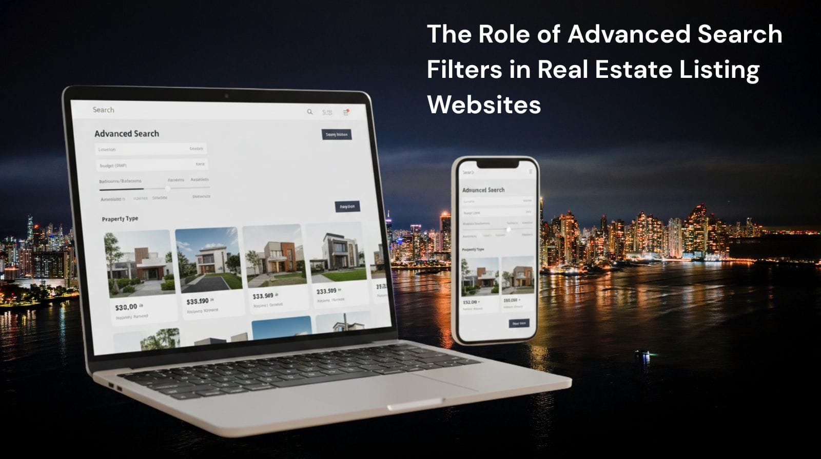
4. Weak or Missing Search Filters
Real estate buyers search based on preferred criteria — location, budget, bedrooms, amenities, and more. A basic search box is not enough.
Fix: Add advanced filters like price sliders, map search, property type filters, and amenities toggles.
5. Low-Quality or Unprofessional Images
Blurry or incomplete listing photos destroy interest and credibility. Buyers expect clear visual information before contacting an agent.
Fix: Use high-resolution images, virtual tours, and consistent formatting.
6. Lack of Interactive Map Search
Modern buyers want to see where a property is located — not just text descriptions. Without maps, location data feels incomplete.
Fix: Add Google Maps or map search integration with pins and neighborhood detail.
7. Weak Call-to-Action (CTA) Placement
A listing may be perfect — but if the user doesn’t know how to take the next step, the lead is lost.
Fix: Use clear CTAs like “Book Viewing,” “Contact Agent,” or “Request Details.”
8. Missing Trust Elements
Real estate is a high-value industry. Without trust markers, users feel unsafe submitting inquiries.
Add:
- Reviews
- Certifications
- Badges
- Verified agent labels
- Secure HTTPS forms
9. Ignoring SEO Best Practices
Many portals don’t use structured data, local keywords, or optimized meta tags — making their listings hard to find.
Fix: Add schema markup, optimize listing titles, and include location-based keywords.
Conclusion
Avoiding these real estate website design mistakes can dramatically improve user experience, search visibility, and lead generation. A clean layout, fast performance, advanced filters, and mobile-first experience ensure that buyers stay engaged and take action — turning browsing sessions into real inquiries and sales.


