Client:
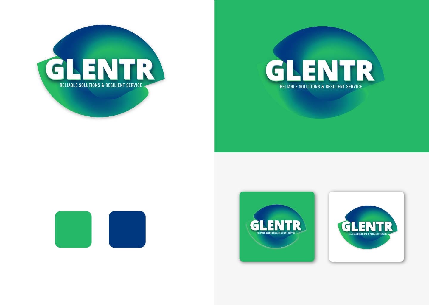
GLENTR – Reliable Solutions & Resilient Service
Category:
Logo
Description:
We designed the GLENTR logo to reflect strength, reliability, and adaptability. The fluid circular form symbolizes continuity and resilience, while the green–blue gradient represents growth, trust, and technological stability. The bold typography ensures strong brand recall, making the identity versatile across digital and print platforms while reinforcing GLENTR’s commitment to dependable solutions and long-term service excellence.
